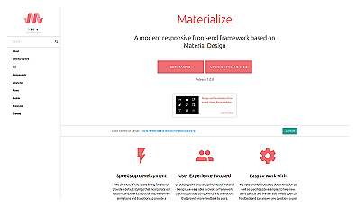
Materialize CSS
A framework for building responsive websites with Material Design.
CSS framework for creating fast, responsive web designs.
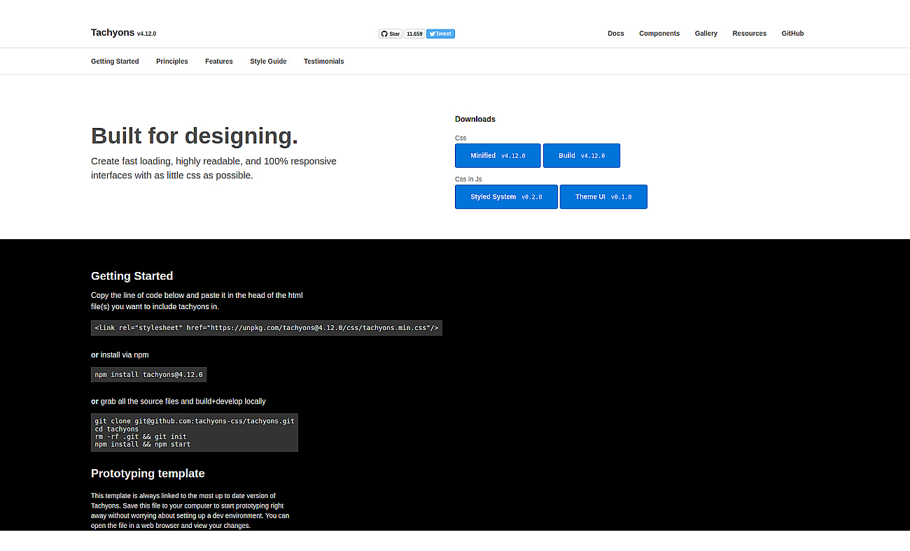
Tachyons is a CSS framework designed for building fast and responsive web designs. It allows developers to create visually appealing layouts with minimal code.
Instead of writing repetitive CSS for each user interface element, Tachyons promotes a modular approach, making it easier to assemble components. This framework supports responsive design from the start, ensuring that websites look great on all devices. With its easy-to-understand documentation, anyone can quickly learn to use Tachyons.
It’s particularly useful for speeding up prototyping, enhancing user experience, and creating accessible interfaces. By using Tachyons, teams can collaborate effectively on design while maintaining consistent patterns across projects.
Based on overlapping tasks and related categories.
A framework for building responsive websites with Material Design.

Create intuitive layouts for mobile and desktop applications.
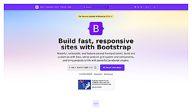
Framework for building responsive websites with ease.
Design and share interactive prototypes with ease.
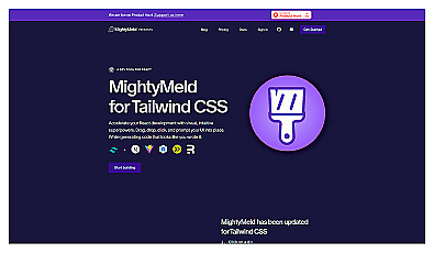
Visual design tool for Tailwind CSS and React development.
Instantly generate design components with AI-driven efficiency.
Discover other similar tools and compare features